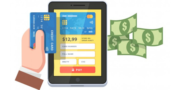
For any digital marketer, checkout phase on his website is the most crucial thing for his business to grow and get better conversion. It is difficult to bring customers inside the conversion funnel, hence making 100% sale is really important. But wait! Reaching till checkout page does not necessarily means conversion. In fact, according to survey conducted by the best internet marketing company,70% of the customers quit the checkout page after encountering it.
This drastic change in mindset in customers can be a result of several factors.
In this post, we will discuss the problems that owners have created in the checkout page that leads to low conversion:
Let’s begin:
- Displaying extra cost in checkout page:
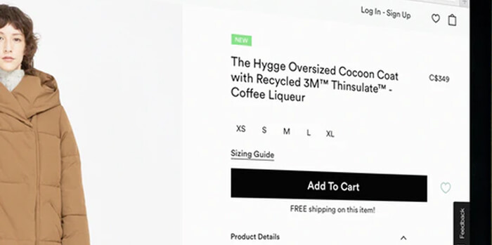
Experts from SEO company in Gurgaon, identifies that extra charges shown in the checkout page holds a very prominent reason for customers to drop out from the shopping cart. Usually extra cost shown are too high which makes customers dissatisfied. These extra cost can be shipping charges, taxes and many other charges which the buyer was unaware
Retailers can control this deflection by keeping the costing absolutely transparent the extra charges that people has to pay during checkout. The best practices is to show all the compiled cost including shipping charges before checkout page.
Not showing prices increases bounce rate as the trust on the seller starts getting disbalanced. Buyers may think the seler to be deceptive. Lack of transparency and the expectation of foul play make them leave the shopping digital marketing company
Another major reason for making dropping from shopping cart is compulsory account making to complete purchase. Making account mandatory may prove troublesome for many kind of customers and also distract customers from the conversion goal. Some of the websites even requires to verify email accounts for making purchase. This is also a big reason for customers abandoning cart as these are unnecessary steps for people who are in hurry.

To stop your customers from abandoning the cart, keep the provision of guest checkout option in your website. This makes it easy for customers to buy product without unnecessary steps.
But there are at times when guest checkout options are a troublesome option for sellers. It becomes difficult to get exact information about the buyer. The easiest solution is, making accounts synced with social media. In this way, buyers would not have to waste time and the information will also be secured.
2. Complicated/ lengthy checkout process
Just like making account,getting length checkout process is equally important reason for people to bounce out from checkout page. Compulsory account making is part of lengthy checkout process or there can be multiple pages that are opened and verified before “ buy now” and finally checkout page. All these things irritate the customers, when they want to place a order in hurry and have to witness long complicated procedure. Ideally sellers should have single page checkout where customers can feed details but make sure to keep only necessary fields. This way checkout process will be smooth and fast.

3. Lack of trust
Online purchase decision revolves around the trust factor.Hence it becomes mandatory to put up best of security assurance to make customers feel secured while they pay. Adding trust symbols is the best way to give people confidence and assurance. Putting up symbol of security will make them perceive your platform safe for making transactions. Some of trusted security seal include Norton, McAFee. TRUSTe, BBB etc.
4. Lack of multiple payment methods
Not getting multiple payments option can also deflect customers from checkout page. Website that supply product throughout the globe should make to provide multiple channels for payment depending upon the convenience of people from various places. Providing multiple payment channel can choose option they prefer such as credit card, debit card, e wallets, online transfer etc.

Conclusion
The above listed five points covers the most common difficulties that people face that lead them to bounce out of checkout page. The main idea should be to give customers a memorable experience which is easy and comfortable. The focus should lie on customers and not sellers.


